There are a number of these desktop apps where the goal is showing your site at different dimensions all at the same time. So you can, for example, be writing CSS and making sure it’s working across all the viewports in a single glance.
They are all very similar. For example, they do “event mirroring” meaning if you scroll in one window or device, then all the others do too, along with clicks, typing, etc. You can also zoom in and out to see many devices at once, just scaled down. Let’s see if we can root out any differences.
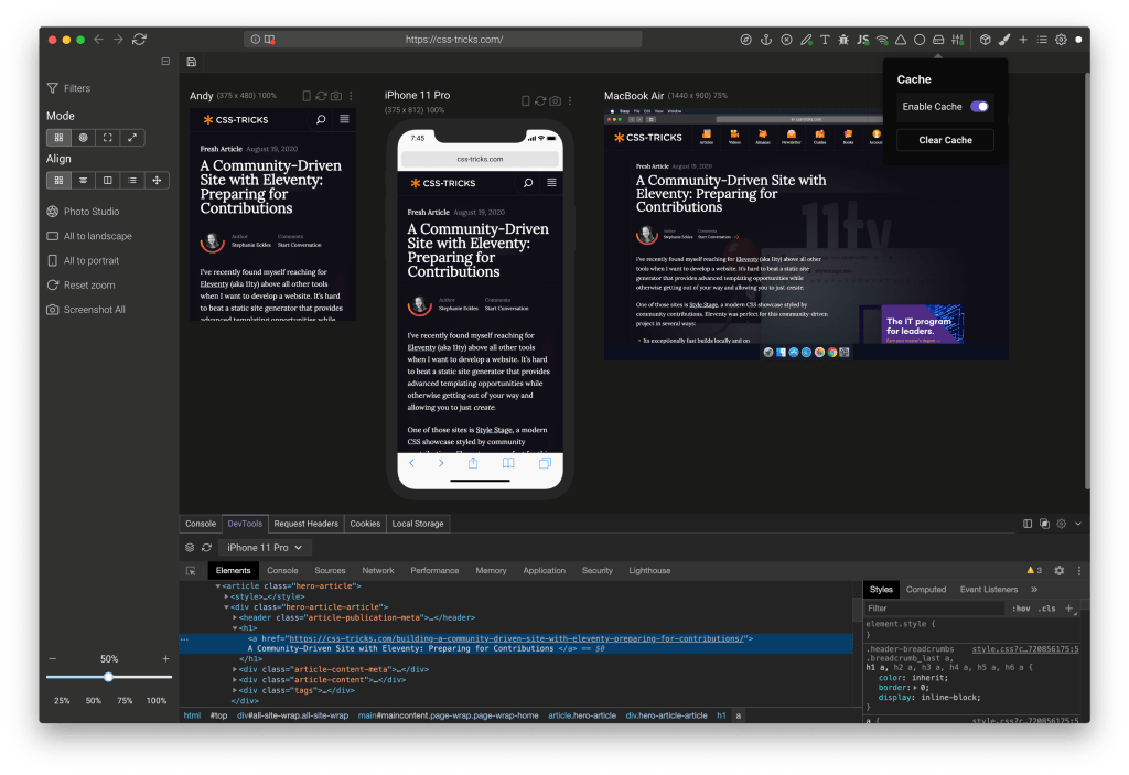
Sizzy
- Windows, Mac, and Linux
- “Solo” plan starts at $5/month and they have plans up from there
There are loads of little cool developer-focused features like:
- Kill a port just by typing in the port number
- There’s a universal inspect mode but, while you can’t apply a change in DevTools that affects all windows and devices at the same time, you can at least inspect across all of them, and when you click, it activates the correct DevTools session.
- Throttle or go offline in a click
- Turn off JavaScript with a click
- Turn on Design Mode with a click (e.g. every element has
contenteditable). - Toggles for hiding images, turning off all styles, outlining all elements, etc.
- Override fonts with Google Font choices
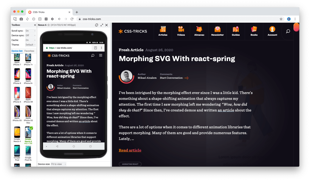
Responsively App
- Windows, Mac, and Linx
- Open source (Free)
- Universal inspect mode that selects the correct DevTools context
- The option to “Disable SSL Validation” is clever, should you run into issues with local HTTPS.
- One-click dark mode toggle
Blisk
- Window and Mac
- Free, with premium upgrades ($10/month). Some of the features like scroll syncing and auto refreshing are listed as premium features, which makes me thing that the free version limits them in some way.
- Auto-refresh is a neat idea. You set up a “watcher” for certain file types in certain folders, and if they change, it refreshes the page. I imagine most dev environments have some kind of style injection or hot module reloading, but having it available anyway is useful for ones that don’t.
- There is no universal DevTools inspector, but you can open the DevTools individually and they do have a custom universal inspection tool for showing the box model dimensions of elements.
- There’s a custom error report screen.
- You can enable “Browsing Mode” to turn off all the fancy device stuff and just use it as a semi-regular browser.
Polypane
- Windows, Mac, and Linux
- Free, with premium plans starting at $10/month. Signing up is going to get you a good handful onboarding emails over a week (with the option to you can opt out).
- It has browser extensions for other browsers to pop your current tab over to Polypane.
- The universal inspect mode seems the most seamless of the bunch to me, but it doesn’t go so far propagate changes across windows and devices. Someone needs to do this! It’s does have a “Live CSS” pane that will inject additional CSS to all the open devices though, which is cool.
- It can open devices based on breakpoints in your own CSS — and it actually works!
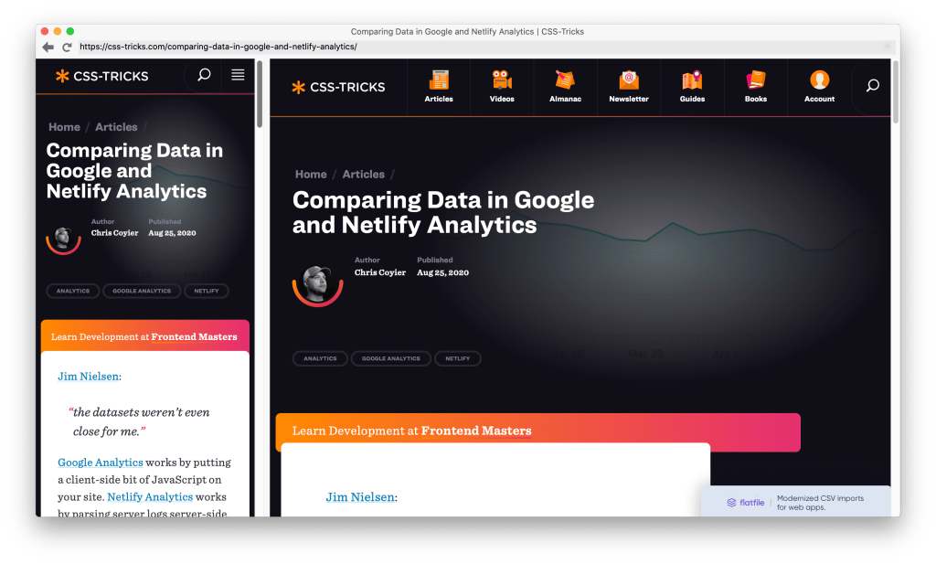
Duo
- It’s on the Mac App Store for $5, but its website is offline, which makes it seem kinda dead.
- It has zero fancy features. As the name implies, it simply shows the same site side-by-side in two columns that can be resized.
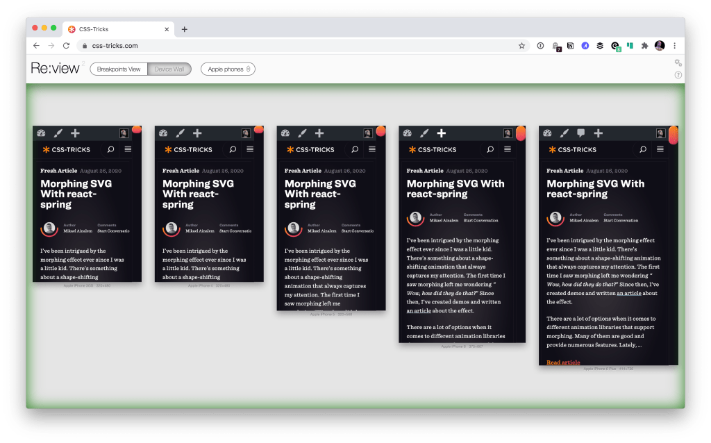
Re:view
- It’s not a separate browser app, but a browser extension. I kind of like this as I can stay in a canonical browser that I’m already comfortable with that’s getting regular updates.
- The “breakpoints” view is a clever idea. I believe it should show your site at the breakpoints in your CSS, but, it seems broken to me. I’m not sure if this is an actively developed project. (My guess is that it is not.)
So?
What, you want me to pick a winner?
While I was turned off a little Polypane’s hoop jumping and onboarding, I think it has the most well-considered feature set. Sizzy is close, but the interface is more cluttered in a way that doesn’t seem necessary. I admit I like how Blisk is really focused on “just look at the mobile view and then we’ll fill the rest of the space with a larger view” because that’s closer to how I actually work. (I rarely need to see a “device wall” of trivially different mobile screens.)
The fact that Responsively is free and open source is very cool, but is that sustainable? I think I feel safer digging into apps that are run as a business. The fact that I just stay in my normal browser with Re:View means I actually have the highest chance of actually using it, but it feels like a dead project at the moment so I probably won’t. So, for now, I guess I’ll have to crown Polypane.

I miss Screenfly :(
It was my favorite because it most closely emulated mobile and tablet behaviors. I’ve tried all of the above and personally I don’t think any are as good as Screenfly was.
Hey Chris, thanks so much for picking Polypane as the winner! Sorry if the onboarding emails were too much. I might’ve added to that by emailing you personally since I was so excited for you to try Polypane!
I’ve already implemented your killer feature in the Polypane elements panel, which you can see in the video on this page at the 0:52 mark. You can select elements in all panes and get their info. Then you can edit content, styling and attributes in all panes at the same time. Once you’re used to that there’s no going back.
Polypane also has a bunch more features. There’s built-in live reloading/”autorefresh”, which updates CSS and images without reloading the page so it’s super fast. There’s 25 different overlays that include a design mode and outlining all elements (which will highlight overflowing elements for you as well) but also color blindness simulators and automated color contrast checking.
The live CSS panel you mentioned will inject any Google font for you and Polypane also has a layout that gives you a regular browser screen that still includes all the dev features Polypane has.
If you’re up for it I’d love to give you a deep-dive overview of all the things Polypane can do.
Kitze from Sizzy here. Thanks for featuring Sizzy on this list!
There are so many extra features that we have like:
– Float Mode
– Photo Studio
– Presets
– Sizzy Projects
– Reference Browser: a browser that you can open within Sizzy so you don’t have to keep another browser open while doing development
etc.
That it’s not fair to be put in a “browser for responsive design” category. We even have a Reference Browser: a browser that you can open within Sizzy so you don’t have to keep another browser open while doing development.
We’re aiming to make Sizzy a browser for developers, regardless if you’re doing responsive design or not.
Also, regarding your note about cluttered UI: you can make the UI look however you want. There is literally a setting for customizing everything. In Sizzy 0.32 we simplified the UI by removing the sidebar and merging all the tabs in one tab bar that’s completely customizable and can be toggled with a shortcut.
@Kitze, i’m a long time Sizzy user and i agree with the author about the UI. It’s cluttered and not very intuitive because of all those features. To be honest, i was quite happy with the basics instead of all the features that i never (or barely) use and slow down Sizzy.
For me Sizzy was the best out there but it became above average when all the features where added, the UI got messy over time and it got slower every release. I still use it by the way but i would love to see the UI got some TLC instead of adding more and and more and more features every release. And V0.32 didn’t make the UI any better, it made it worser to be honest.
FYI, polypane isn’t free it just offers trial.
Interestingly, Sizzy offers a $249 lifetime license. I’m always on the fence about ‘lifetime’ licenses. On the one hand it’s often not a sustainable model. On the other hand, I really don’t care for subscriptions, so I’m always tempted.
Responsive Viewer is another Chrome Extension that I can really recommend
With the FirFox browser responsive design allows creating a screen larger than the computer. Scroll bars are used to view that screen a portion at a time. It can screen shot the whole screen to a png file.
Are there other browses that can do this.