As the title says, we are going to decorate images! There’s a bunch of other articles out there that talk about this, but what we’re covering here is quite a bit different because it’s more of a challenge. The challenge? Decorate an image using only the <img> tag and nothing more.
That right, no extra markup, no divs, and no pseudo-elements. Just the one tag.
Sounds difficult, right? But by the end of this article — and the others that make up this little series — I’ll prove that CSS is powerful enough to give us great and stunning results despite the limitation of working with a single element.
Fancy Image Decorations series
- Single Element Magic — you are here
- Masks and Advanced Hover Effects
- Outlines and Complex Animations
Let’s start with our first example
Before digging into the code let’s enumerate the possibilities for styling an <img> without any extra elements or pseudo-elements. We can use border, box-shadow, outline, and, of course, background. It may look strange to add a background to an image because we cannot see it as it will be behind the image — but the trick is to create space around the image using padding and/or border and then draw our background inside that space.
I think you know what comes next since I talked about background, right? Yes, gradients! All the decorations we are going to make rely on a lot of gradients. If you’ve followed me for a while, I think this probably comes as no surprise to you at all. 😁
Let’s get back to our first example:
img {
  --s: 10px; /* control the size */
  padding: var(--s);
  border: calc(2 * var(--s)) solid #0000;
  outline: 1px solid #000;
  outline-offset: calc(-1 * var(--s));
  background: conic-gradient(from 90deg at 1px 1px, #0000 25%, #000 0);
}
We are defining padding and a transparent border using the variable --s to create a space around our image equal to three times that variable.
Why are we using both padding and border instead of one or the other? We can get by using only one of them but I need this combination for my gradient because, by default, the initial value of background-clip is border-box and background-origin is equal to padding-box.
Here is a step-by-step illustration to understand the logic:
Initially, we don’t have any borders on the image, so our gradient will create two segments with 1px of thickness. (I am using 3px in this specific demo so it’s easier to see.) We add a colored border and the gradient still gives us the same result inside the padding area (due to background-origin) but it repeats behind the border. If we make the color of the border transparent, we can use the repetition and we get the frame we want.
The outline in the demo has a negative offset. That creates a square shape at the top of the gradient. That’s it! We added a nice decoration to our image using one gradient and an outline. We could have used more gradients! But I always try to keep my code as simple as possible and I found that adding an outline is better that way.
Here is a gradient-only solution where I am using only padding to define the space. Still the same result but with a more complex syntax.
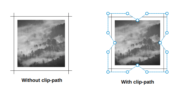
Let’s try another idea:
For this one, I took the previous example removed the outline, and applied a clip-path to cut the gradient on each side. The clip-path value is a bit verbose and confusing but here is an illustration to better see its points:
I think you get the main idea. We are going to combine backgrounds, outlines, clipping, and some masking to achieve different kinds of decorations. We are also going to consider some cool hover animations as an added bonus! What we’ve looked at so far is merely a small overview of what’s coming!
The Corner-Only Frame
This one takes four gradients. Each gradient covers one corner and, on hover, we expand them to create a full frame around the image. Let’s dissect the code for one of the gradients:
--b: 5px; /* border thickness */
background: conic-gradient(from 90deg at top var(--b) left var(--b), #0000 90deg, darkblue 0) 0 0;
background-size: 50px 50px;
background-repeat: no-repeat;
We are going to draw a gradient with a size equal to 50px 50px and place it at the top-left corner (0 0). For the gradient’s configuration, here’s a step-by-step illustration showing how I reached that result.
We tend to think that gradients are only good for transitioning between two colors. But in reality, we can do so much more with them! They are especially useful when it comes to creating different shapes. The trick is to make sure we have hard stops between colors — like in the example above — rather than smooth transitions:
#0000 25%, darkblue 0This is basically saying: “fill the gradient with a transparent color until 25% of the area, then fill the remaining area with darkblue.
You might be scratching your head over the 0 value. It’s a little hack to simplify the syntax. In reality, we should use this to make a hard stop between colors:
#0000 25%, darkblue 25%That is more logical! The transparent color ends at 25% and darkblue starts exactly where the transparency ends, making a hard stop. If we replace the second one with 0, the browser will do the job for us, so it is a slightly more efficient way to go about it.
Somewhere in the specification, it says:
if a color stop or transition hint has a position that is less than the specified position of any color stop or transition hint before it in the list, set its position to be equal to the largest specified position of any color stop or transition hint before it.
0 is always smaller than any other value, so the browser will always convert it to the largest value that comes before it in the declaration. In our case, that number is 25%.
Now, we apply the same logic to all the corners and we end with the following code:
img {
  --b: 5px; /* border thickness */
  --c: #0000 90deg, darkblue 0; /* define the color here */
  padding: 10px;
  background:
    conic-gradient(from 90deg  at top    var(--b) left  var(--b), var(--c)) 0 0,
    conic-gradient(from 180deg at top    var(--b) right var(--b), var(--c)) 100% 0,
    conic-gradient(from 0deg   at bottom var(--b) left  var(--b), var(--c)) 0 100%,
    conic-gradient(from -90deg at bottom var(--b) right var(--b), var(--c)) 100% 100%;
  background-size: 50px 50px; /* adjust border length here */
  background-repeat: no-repeat;
}
I have introduced CSS variables to avoid some redundancy as all the gradients use the same color configuration.
For the hover effect, all I’m doing is increasing the size of the gradients to create the full frame:
img:hover {
  background-size: 51% 51%;
}
Yes, it’s 51% instead of 50% — that creates a small overlap and avoids possible gaps.
Let’s try another idea using the same technique:
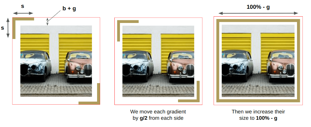
This time we are using only two gradients, but with a more complex animation. First, we update the position of each gradient, then increase their sizes to create the full frame. I also introduced more variables for better control over the color, size, thickness, and even the gap between the image and the frame.
img {
  --b: 8px;  /* border thickness*/
  --s: 60px; /* size of the corner*/
  --g: 14px; /* the gap*/
  --c: #EDC951;

  padding: calc(var(--b) + var(--g));
  background-image:
    conic-gradient(from  90deg at top    var(--b) left  var(--b), #0000 25%, var(--c) 0),
    conic-gradient(from -90deg at bottom var(--b) right var(--b), #0000 25%, var(--c) 0);
  background-position:
    var(--_p, 0%) var(--_p, 0%),
    calc(100% - var(--_p, 0%)) calc(100% - var(--_p, 0%));
  background-size: var(--s) var(--s);
  background-repeat: no-repeat;
  transition:
    background-position .3s var(--_i,.3s),
    background-size .3s calc(.3s - var(--_i, .3s));
}
img:hover {
  background-size: calc(100% - var(--g)) calc(100% - var(--g));
  --_p: calc(var(--g) / 2);
  --_i: 0s;
}
Why do the --_i and --_p variables have an underscore in their name? The underscores are part of a naming convention I use to consider “internal” variables used to optimize the code. They are nothing special but I want to make a difference between the variables we adjust to control the frame (like --b, --c, etc.) and the ones I use to make the code shorter.
The code may look confusing and not easy to grasp but I wrote a three-part series where I detail such technique. I highly recommend reading at least the first article to understand how I reached the above code.
Here is an illustration to better understand the different values:
The Frame Reveal
Let’s try another type of animation where we reveal the full frame on hover:
Cool, right? And you if you look closely, you will notice that the lines disappear in the opposite direction on mouse out which makes the effect even more fancy! I used a similar effect in a previous article.
But this time, instead of covering all the element, I cover only a small portion by defining a height to get something like this:
This is the top border of our frame. We repeat the same process on each side of the image and we have our hover effect:
img {
  --b: 10px; /* the border thickness*/
  --g: 5px; /* the gap on hover */
  --c: #8A9B0F;

  padding: calc(var(--g) + var(--b));
  --_g: no-repeat linear-gradient(var(--c) 0 0);
  background:
    var(--_g) var(--_i, 0%) 0,
    var(--_g) 100% var(--_i, 0%),
    var(--_g) calc(100% - var(--_i, 0%)) 100%,
    var(--_g) 0 calc(100% - var(--_i, 0%));
  background-size: var(--_i, 0%) var(--b),var(--b) var(--_i, 0%);
  transition: .4s, background-position 0s;
  cursor: pointer;
}
img:hover {
  --_i: 100%;
}
As you can see, I am applying the same gradient four times and each one has a different position to cover only one side at a time.
Another one? Let’s go!
This one looks a bit tricky and it indeed does require some imagination to understand how two conic gradients are pulling off this kind of magic. Here is a demo to illustrate one of the gradients:
The pseudo-element simulates the gradient. It’s initially out of sight and, on hover, we first change its position to get the top edge of the frame. Then we increase the height to get the right edge. The gradient shape is similar to the ones we used in the last section: two segments to cover two sides.
But why did I make the gradient’s width 200%? You’d think 100% would be enough, right?
100% should be enough but I won’t be able to move the gradient like I want if I keep its width equal to 100%. That’s another little quirk related to how background-position works. I cover this in a previous article. I also posted an answer over at Stack Overflow dealing with this. I know it’s a lot of reading, but it’s really worth your time.
Now that we have explained the logic for one gradient, the second one is easy because it’s doing exactly the same thing, but covering the left and bottom edges instead. All we have to do is to swap a few values and we are done:
img {
  --c: #8A9B0F; /* the border color */
  --b: 10px; /* the border thickness*/
  --g: 5px;  /* the gap */

  padding: calc(var(--g) + var(--b));
  --_g: #0000 25%, var(--c) 0;
  background:
    conic-gradient(from 180deg at top    var(--b) right var(--b), var(--_g))
     var(--_i, 200%) 0 / 200% var(--_i, var(--b))  no-repeat,
    conic-gradient(            at bottom var(--b) left  var(--b), var(--_g))
     0 var(--_i, 200%) / var(--_i, var(--b)) 200%  no-repeat;
  transition: .3s, background-position .3s .3s;
  cursor: pointer;
}
img:hover {
  --_i: 100%;
  transition: .3s, background-size .3s .3s;
}
As you can see, both gradients are almost identical. I am simply swapping the values of the size and position.
The Frame Rotation
This time we are not going to draw a frame around our image, but rather adjust the look of an existing one.
You are probably asking how the heck I am able to transform a straight line into an angled line. No, the magic is different than that. That’s just the illusion we get after combining simple animations for four gradients.
Let’s see how the animation for the top gradient is made:
I am simply updating the position of a repeating gradient. Nothing fancy yet! Let’s do the same for the right side:
Are you starting to see the trick? Both gradients intersect at the corner to create the illusion where the straight line is changed to an angled one. Let’s remove the outline and hide the overflow to better see it:
Now, we add two more gradients to cover the remaining edges and we are done:
img {
  --g: 4px; /* the gap */
  --b: 12px; /* border thickness*/
  --c: #669706; /* the color */

  padding: calc(var(--g) + var(--b));
  --_c: #0000 0 25%, var(--c) 0 50%;
  --_g1: repeating-linear-gradient(90deg ,var(--_c)) repeat-x;
  --_g2: repeating-linear-gradient(180deg,var(--_c)) repeat-y;
  background:
    var(--_g1) var(--_p, 25%) 0,
    var(--_g2) 0 var(--_p, 125%),
    var(--_g1) var(--_p, 125%) 100%,
    var(--_g2) 100% var(--_p, 25%);
  background-size: 200% var(--b), var(--b) 200%;
  transition: .3s;
}
img:hover {
  --_p: 75%;
}
If we take this code and slightly adjust it, we can get another cool animation:
Can you figure out the logic in this example? That’s your homework! The code may look scary but it uses the same logic as the previous examples we looked at. Try to isolate each gradient and imagine how it animates.
Wrapping up
That’s a lot of gradients in one article!
It sure is and I warned you! But if the challenge is to decorate an image without an extra elements and pseudo-elements, we are left with only a few possibilities and gradients are the most powerful option.
Don’t worry if you are a bit lost in some of the explanations. I always recommend some of my old articles where I go into greater detail with some of the concepts we recycled for this challenge.
- Background pattern using conic-gradient: This article will familiarize you with the
conic-gradient()syntax. - Hover effect using background properties: This article covers different background tricks to create cool animations with efficient code. This one is a must-read because there’s a lot on CSS variables and
calc()which are big parts of what we covered here. - All you need to know about background-position: This article shares the secret sauce behind the use of
background-positionin the examples we looked at.
I am gonna leave with one last demo to hold you over until the next article in this series. This time, I am using radial-gradient() to create another funny hover effect. I’ll let you dissect the code to grok how it works. Ask me questions in the comments if you get stuck!
Fancy Image Decorations series
- Single Element Magic — you are here
- Masks and Advanced Hover Effects
- Outlines and Complex Animations

A great article with some great css techniques.
yes it’s true
Great article. I really liked the ideas and I’m definitely going to try similar stuff on my projects.
I’m excited that there is two more parts!