👻 👻 👻
[Robin]: This week Simon Hearne wrote this mighty fine piece about web performance and survivorship bias. His argument is this: we have a bunch of data about how our website is doing (and how poor the user experience is when it comes to performance) but often the data that’s missing is the data we need the most. For example:
The users who have the worst experiences are likely to be phantom bounces: they don’t appear in your analytics or intelligence tools because they don’t hang around long enough for the app to load and analytics to fire.
I must’ve been a phantom bouncer at least a dozen times myself just this week alone; tried to load a website, it was blank for too long, so I just quit my browser and went back to doing something else.
The problem here is that dev teams will often look at these stats and say, “Ah, we don’t need to worry about performance on platform X because we don’t get much traffic there,” without them realizing that they might not be seeing all the data clearly (phantom bounces). But also, the traffic problems could be caused by those performance problems. Simon writes:
It is clear that poor performance will impact your traffic numbers, and means that thousands of potential visitors are leaving your site without a trace. It is also clear that mobile visitors are less tolerant of slow sites.
Scary! But reading this makes me want to be ruthless when it comes to performance. No fonts! No colors! No text! I’m kidding here of course but this is an extremely good reminder that web performance is not a feature you can tack-on.
Ya know what this reminds me of though? Responsive design! Back in the day (and dear lord still too often today) I hear folks say stuff like, “Ah, we don’t get much mobile traffic so we shouldn’t make our big web app responsive.” This is the same kind of logic with the same flaw in its thinking. We don’t have much mobile traffic because our website isn’t responsive.
📈 📈 📈
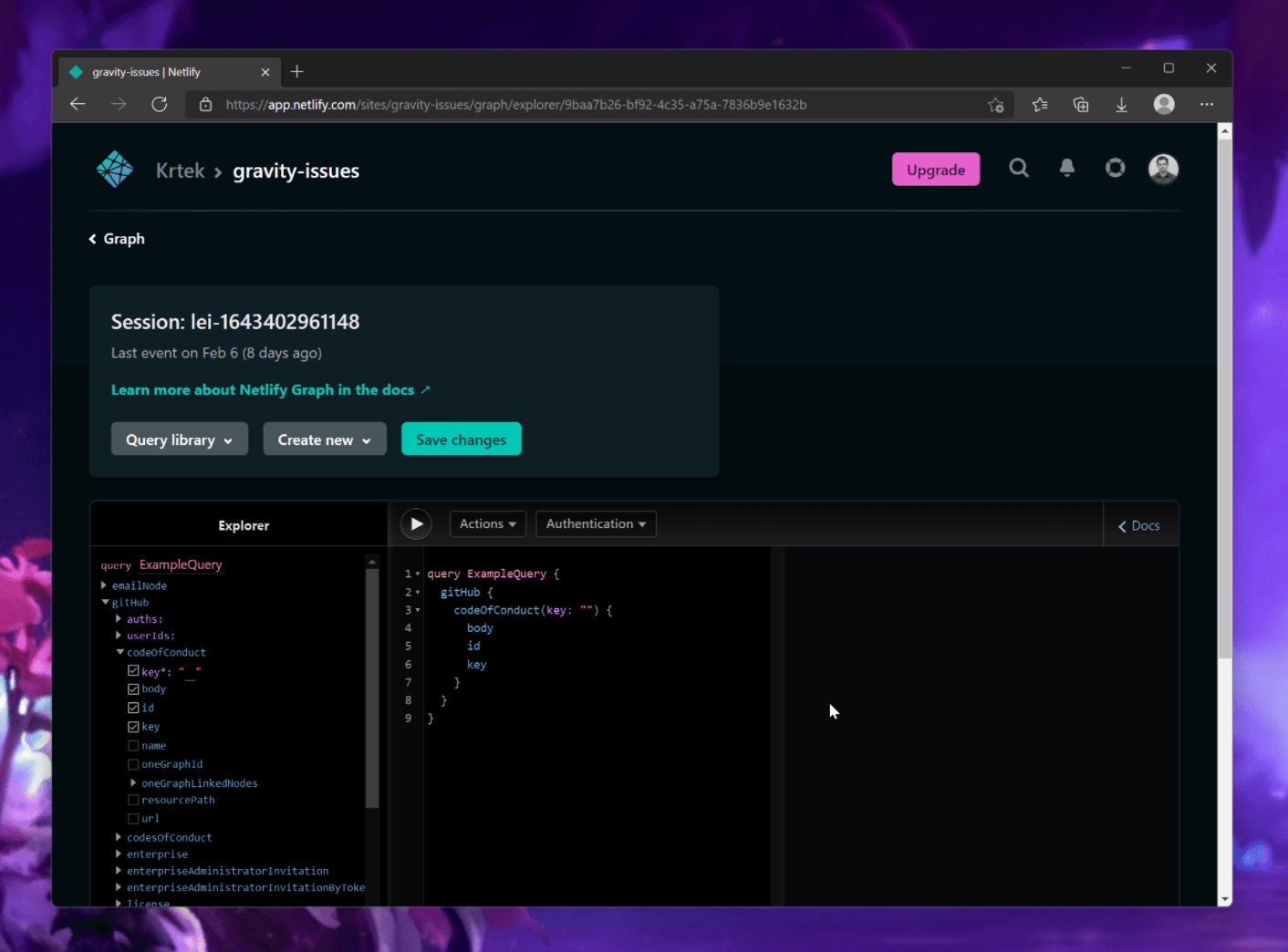
The Netlify Graph was announced earlier this week and it looks extremely exciting. I need to set aside some time to play around with it but here’s a quick video that explains it all:
After adding APIs, you can use the new Graph Explorer to build queries and generate serverless function code. As you iterate, you can seamlessly sync changes to your local repository, where you can test them in the local Netlify environment before deploying.
So: take an API, select the bits of code that you want, throw that into a serverless function, and then test locally on your website? That sounds neat as heck! I don’t want to have to trawl through a bunch of docs when I’m playing with an API — I sort of want to learn by doing. And this looks like that.
On this note, I saw that Raymond Camden also used the Netlify Graph to hit the Spotify API and return the latest tracks he’s played. He seems pretty dang impressed:
It’s all kinda… magical honestly. As I said, I definitely hit a few rough spots and I’d probably wait before using this in production for a “real” site, but even right now it’s pretty freaking cool.
All of this reminds me of Chris’s talk back at Jamstack Conf in 2018 where he talked about how powerful front-end developers are becoming because this Netlify Graph stuff seems like it opens up a ton of extra super powers like that in the near future.
🔗 🔗 🔗
Harshil Patel wrote this swell post about hover effects on hyperlinks:
Creating CSS link hover effects can add a bit of flair to an otherwise bland webpage. If you’ve ever found yourself stumped trying to make a slick hover effect, then I have six CSS effects for you to take and use for your next project.
Lots of neat stuff in here, but perhaps my favorite is the rainbow underline effect Harshil shows that uses a linear-gradient and a tiny transition to push a blue underline away and replace it with a bright and vibrant one. But this reminds me that not so long ago, Geoff Graham wrote about how to replicate Adam Argyle’s punk rock CSS hover effect where the background of a link looks like an annotation:
Also, sidenote: do you know why hyperlinks were blue? Elise Blanchard wrote a great piece about them a while back:
As a user experience designer who has created websites since 2001, I’ve always made my links blue. I have advocated for the specific shade of blue, and for the consistent application of blue, yes, but I’ve never stopped and wondered, why are links blue? It was just a fact of life. Grass is green and hyperlinks are blue. Culturally, we associate links with the color blue so much that in 2016, when Google changed its links to black, it created quite a disruption.
🔻 🔻 🔻
Mike Skowronek upset me this week when he tweeted this:
In @ChromeDevTools holding SHIFT while moving mouse over resources in network panel shows you which asset caused to load another asset.
What! That’s so neat. You can directly see when one resource is the child of another like this:
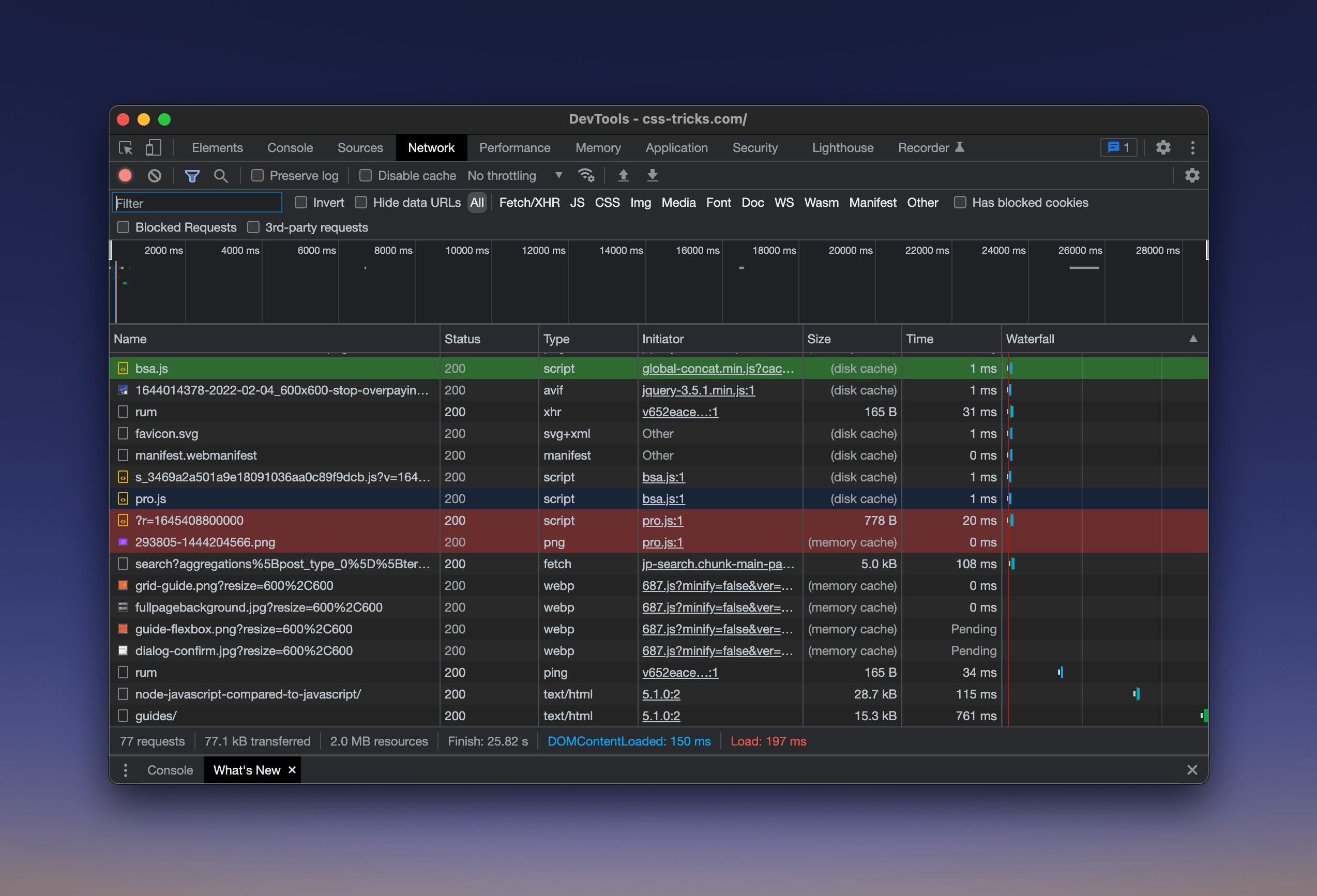
That will most certainly come in handy at one point or another.

Sponsor
Astra DB
Do more with Astra DB, the only DBaaS that helps developers build Apache Cassandra™ apps faster.

Sponsor
WordPress.com Has a New Home on YouTube
The WordPress.com team set up a brand spankin’ new YouTube channel full of fresh videos that walk you through everything you could ever want to know about using WordPress, including how the new Site Editor works, how to set up a homepage, and much more.
Anyone running a WordPress site, self-hosted or not, will benefit from these step-by-step tutorials.
[Chris]: Have y’all seen :focus-visible in CSS? Pawel Grzybek just blogged The difference between CSS focus and :focus-visible pseudo-class. I’ll try to summarize in one sentence:
The :focus-visible pseudo selector in CSS only applies when an interactive element becomes in focus via keyboard navigation, while the :focus pseudo selector applies when an interactive element becomes in focus for any reason.
What’s the point? Mostly one thing: :focus styles are super very important for people navigating with a keyboard and probably should have pretty big bold styles. But if you’re navigating with a mouse, those big bold styles can be visually annoying, because you’ll see them whenever you click onto any interactive element. Because of that visual annoyance, it’s driven people to have minimal focus styles that may not be enough for keyboard navigators, or worse, none at all.
It’s actually a bit more complicated than keyboard-or-not. The Chromium blog gets into the heuristics for how it’s all determined.
If you were sure that 100% of the users of your website are using a browser the supports :focus-visible, or were polyfilling it, I could see being tempted to only use it for focus styles. That way you don’t have to worry about styles being applied from clicks but key the nice keyboard focus styles. I dunno though, I think that might be swinging the pendulum too far back the other way. It’s probably more likely we start using The :focus-visible Trick where we have an opportunity for different styles either way.
/* Focusing the button with a keyboard will show a dashed black line. */
button:focus-visible {
  outline: 4px dashed black;
}

/* Focusing the button with a mouse, touch, or stylus will show a subtle drop shadow. */
button:focus:not(:focus-visible) {
  outline: none;
  box-shadow: 1px 1px 5px rgba(1, 1, 0, .7);
}
Why is this all being talked about recently again? Because a new Safari Technology Preview version was released with support for it, bringing support across all The Big Three. Who did that work? Igalia did. They had this grand idea called Open Prioritization to see if web developers themselves could fund particular things to make browsers better. The winner of that was :focus-visible in WebKit/Safari. Then they did exactly what they said they were going to do and did the work.
Yet, it caused 🔥 controversy 🔥, mostly in the form of: “The richest company in the world needs to do crowdfunding to implement standardized web features?!” Which, like all the hottest controversy, has a certain understandability to it. It’s easy to fantasize about the web getting better because Apple taking, I dunno, a few billion and slapping it into making WebKit/Safari the most rootin’ tootin’ browser around (and conversely, opening up iOS to browser engine competition).
The thing is, Apple doesn’t “own” WebKit, as it’s an open-source project. Apple can’t control who contributes to that, nor do they want to. You can criticize them for being slow on feature support, but you can’t blame them for what outside contributors do. Eric Meyer does a good job at pouring water on all that fire.
Nobody at Apple asked the crowd to fund anything. Nobody at Apple asked Igalia to crowdfund anything. They didn’t even ask Igalia to implement
:focus-visible, and then Igalia decided to crowdfund the work. In fact, all of those assumptions get things almost exactly backwards — which is understandable! It’s what we expect from our experience of how the web has developed since at least the late 1990s
Anyway, it’s nice to see the web improving. Should be a banner year for CSS. And Safari is really accelerating in support for all sorts of things. Looks like it’s a first mover on the inert attributes, which will be amazing.
