DigitalOcean provides cloud products for every stage of your journey. Get started with $200 in free credit!
padding-inline is a CSS logical shorthand property that combines the padding-inline-start and padding-inline-end properties into a single declaration, creating space around an element’s content in the inline (left and right) direction.
.element {
  padding-inline: 30px 60px;
  writing-mode: vertical-rl; /* Determines the padding block direction */
}
When we say that padding-inline “creates space around an element’s content” we mean space that provides extra breathing room between the element’s content and the element’s edges.
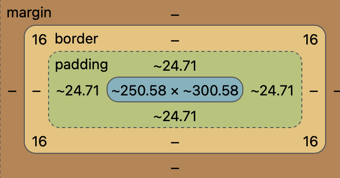
And that spacing is inside any margins and borders. In other words, it’s the innermost spacing that makes up an element’s Box Model.
The padding-inline property may be specified with one or two values. If one value is given, it is used as the value for both padding-inline-start and padding-inline-end. If two values are given, the first is used for padding-inline-start and the second for padding-inline-end.
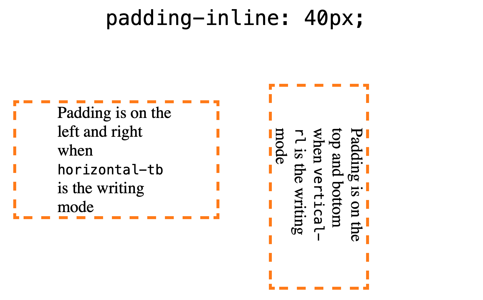
The direction depends on the writing mode
padding-block is a logical property, which means it adapts the writing-mode of a page. So, when we’re in a default horizontal top-to-bottom writing mode (writing mode: horizontal-tb), the block direction goes from top to bottom. But when the writing mode changes to a vertical writing mode (e.g. writing-mode: vertical-rl), the element is rotated turning the block direction into an inline direction where the padding goes from left-to-right (or right-to-left, depending on the exact writing mode).
Another way to think about it: padding-block behaves like padding-top and padding-bottom in a default horizontal writing mode, but it behaves like padding-left and padding-right in a vertical writing mode.
The writing-mode defaults to horizontal top-to-bottom if it is not explicitly declared.
Syntax
padding-inline: <'padding-top'>{1,2};It seems weird to see the syntax of one property reference the syntax of another CSS property right in the documentation, but that’s really what it is. What it’s basically trying to say is that the property accepts the same values as padding-top (up to two times) which follows this syntax:
padding-top: <length> | <percentage> | auto;- Initial value:
0 - Applies to: all elements except internal table elements, ruby base containers, and ruby annotation containers
- Inherited: no
- Percentages: as for the corresponding physical property
- Computed value: same as corresponding
padding-*properties - Animation type: by computed value type
Values
If you’re familiar with the padding shorthand property, then padding-inline will feel very familiar. The only difference is that it works in two directions instead of four.
/* Length values */
padding-inline: 20px 40px;
padding-inline: 2rem 4rem;
padding-inline: 25% 15%;
padding-inline: 20px; /* a single value sets both values */

/* Keyword values */
padding-inline: auto;

/* Global values */
padding-inline: inherit;
padding-inline: initial;
padding-inline: unset;
Constituent properties
We said earlier that padding-inline is a shorthand property. That means it combines multiple properties into one declaration, and those included properties are called constituent properties.
Let’s look specifically at the padding-inline-start and padding-inline-end CSS properties, which makes up the padding-block shorthand. They’re handy as they allow us to define padding in the inline direction, one side at a time.
padding-inline-start
padding-inline-start adds padding to the logical “starting” edge of an element in the inline direction. So, if we were working in, say, a default horizontal top-to-bottom writing mode, then the left side of the element is the start and — spoiler alert — the right side of the element is the end.
.element {
  padding-inline-start: 30px;
  writing-mode: vertical-rl; /* Determines the padding block direction */
}But! If we were to change the writing direction to, say, vertical left-to-right, then the starting edge is rotated 90 degrees, which makes the element’s starting edge the top.
This also applies in a vertical right-to-left writing mode, as illustrated in the example above.
| Writing mode | Starting edge |
|---|---|
horizontal-tb | Left padding |
vertical-lr | Top padding |
vertical-rl | Top padding |
padding-inline-end
padding-inline-end is everything we just looked at with padding-inline-start, only in the opposite direction. So, if the “start” in a horizontal top-to-bottom writing mode is the element’s left side, the “end” is the right side.
Both vertical left-to-right and vertical right-to-left place the “end” at the bottom edge of an element.
.element {
  padding-inline-end: 30px;
  writing-mode: vertical-rl; /* Determines the padding block direction */
}| Writing mode | Ending edge |
|---|---|
horizontal-tb | Right padding |
vertical-lr | Bottom padding |
vertical-rl | Bottom padding |
Browser support
| IE | Edge | Firefox | Chrome | Safari | Opera |
|---|---|---|---|---|---|
| No | 87+ | 66+ | 87+ | 14.1 | 73 |
| Android Chrome | Android Firefox | Android Browser | iOS Safari | Opera Mobile |
|---|---|---|---|---|
| Yes | Yes | 93+ | 14.7+ | No |
More information
Related
direction
.element { direction: rtl; }
margin-block
.element { margin-block: 30px 60px; }
margin-inline
.element { margin-inline: 60px auto; }
padding
.element { padding: 35px auto; }
padding-block
.element { padding-block: 30px 60px; }
text-orientation
element { text-orientation: mixed; }
writing-mode
.element { writing-mode: vertical-rl; }
