Perhaps my favorite CSS trick of all time! This one makes use of four layered background gradients that reveal shadows on the top and bottom of containers that scroll to indicate you can scroll in that direction. It’s just good UX, and even moreso now than it was in 2012 when it was invented as scrollbar-less UIs are more and more common.
The idea of scroll shadows makes an absolute ton of sense. When a container is scrolled down, you can see a shadow at the top, which makes it clear you can scroll back up. And if it’s possible to scroll down, there is a shadow down there also, unless you’ve scrolled down all the way.
This might just be my favorite CSS trick of all time. The idea comes by way of Roman Komarov, but then Lea Verou came up with the extra fancy CSS trickery and popularized it.
Scroll shadows are such nice UX, it almost makes you wonder why it’s not a native browser feature, or at least easier to pull off in CSS. You could call them an affordance, an obvious visual cue that scrolling is either possible or complete, that doesn’t require any learning.
Here’s a working example:
Here’s what it looks like. When you can scroll down, there is a shadow there that makes it look like you can. When you can scroll both ways, there are shadows on both top and bottom. When you can only scroll up, the shadow is only on top.


It’s a bit of a mind-bender understanding how it works, in part because it uses background-attachment: local; which is a rare thing to use, to say the least. Here’s an attempt:
- There are two types of shadows at work here:
- Regular shadows
- Cover shadows
- All of the shadows are created with background gradients. For example, a non-repeating
radial-gradientsized and placed at the center top of the element to look like a shadow. - The cover shadows are placed on top of those regular shadows, by way of the stacking order of multiple backgrounds, and capable of entirely hiding them.
- The regular shadows use the default value of
background-attachment, which isscroll, which you’ll be familiar with because it’s the way backgrounds normally work in that you don’t really think about it. The backgrounds are just there, positioned in the visible portion of the element, and don’t move around as the element scrolls. - The overflow shadows us the unusual
background-attachment: local;which places them at the top and bottom edges of the element factoring in the entire scroll height of the element. They move as the elements scroll position moves.
So imagine this scenario: the element overflows vertically, and it is currently all the way scrolled to the top. Both the top shadow and the top shadow cover are at the top of the element. The cover is on top, hiding the shadow like it’s not there at all. Scroll down a little, and the cover sticks to the very top of the element, now hidden by overflow, so you can’t see the cover anymore and the shadow reveals itself. At the bottom, you’ve been able to see the shadow the whole time because the cover is stuck to the very bottom of the element and the shadow is stuck to the bottom of the visible area. Scroll all the way to the bottom and the cover will overlap the bottom shadow, hiding it. That’s a mouthful, but it all works!
The beauty of it is how it’s just a few lines of code you can apply to a single element to get it done.
.scroll-shadows {
  max-height: 200px;
  overflow: auto;

  background:
    /* Shadow Cover TOP */
    linear-gradient(
      white 30%,
      rgba(255, 255, 255, 0)
    ) center top,

    /* Shadow Cover BOTTOM */
    linear-gradient(
      rgba(255, 255, 255, 0),
      white 70%
    ) center bottom,

    /* Shadow TOP */
    radial-gradient(
      farthest-side at 50% 0,
      rgba(0, 0, 0, 0.2),
      rgba(0, 0, 0, 0)
    ) center top,

    /* Shadow BOTTOM */
    radial-gradient(
      farthest-side at 50% 100%,
      rgba(0, 0, 0, 0.2),
      rgba(0, 0, 0, 0)
    ) center bottom;

  background-repeat: no-repeat;
  background-size: 100% 40px, 100% 40px, 100% 14px, 100% 14px;
  background-attachment: local, local, scroll, scroll;
}
It doesn’t have to work on only white backgrounds either, but it does need to be a flat color.
Here’s a version with the colors abstracted into CSS custom properties:
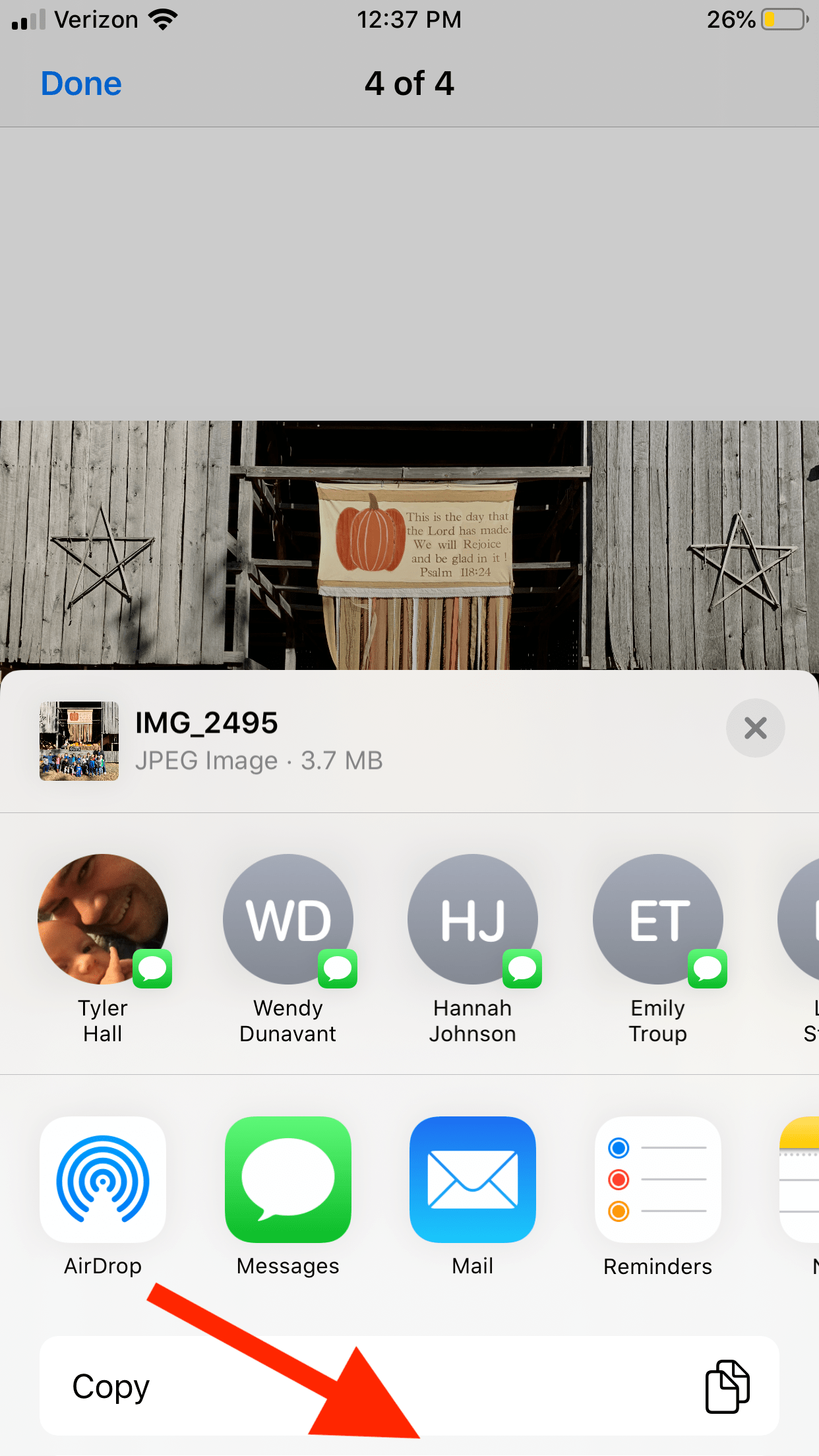
This can be much more than just a UI/UX nicety, it can be vital for indicating when a container has more stuff in it that can be scrolled to in a situation where the container doesn’t have a scrollbar or any other UI to indicate it can be scrolled. Consider the story Perfectly Cropped from Tyler Hall in which shares how confused his family members are about the sharing panel in iOS 13. It’s entirely not obvious that you can scroll down here in this screenshot.
Other Tricks
Perhaps the shadow could be bigger or stronger depending on how much there is to scroll?
Hakim El Hattab once tweeted an example of this that did a great job of demonstrating.
See the shadows along the left sidebar here:


Note that that demo uses a bit of JavaScript to do its thing. Of course, I’m attracted to the CSS-only version, particularly here as it is so easy to apply to a single element. But there are lots of takes of this with JavaScript, like:
- This one that inserts and fades the shadows in and out as needed
- This one using React Hooks
- This one using the Intersection Observer API
Despite my attraction to only doing this in CSS, there is another reason you might want to reach for a JavaScript-powered solution instead: iOS Safari. Back in June 2019, when iOS 13 shipped, the version of Safari in that (and every version since), this technique fails to work on. I’m actually not 100% sure why. It seems like a bug. It broke at the same time clever CSS-powered parallax broke on iOS Safari. It may have something to do with how they “cache” certain painted layers of sites. It sure would be nice if they would fix it.
